For the love of advertising

We asked members of the RKH team what they love most about working in advertising and creative – he…

In the vast digital landscape, where attention spans are shorter than ever, a well-designed landing page can make all the difference between capturing a visitor's interest or losing them for good. Whether you're a marketer, account manager or web designer, understanding the art of a compelling landing page is crucial for driving conversions and achieving online success.
Your landing page serves as a gateway to your brand, product, or service. It is the virtual storefront that entices visitors to take action and explore further. But what makes a landing page truly effective? How can you optimise its design to maximise user engagement and conversion rates?
In this blog, our experts will delve deep into the realm of landing page design and explore invaluable tips and examples to help you create landing pages that not only captivate your audience but also drive desired actions. From the strategic placement of compelling content to the clever use of visuals and persuasive elements, we'll guide you through the process of perfecting your landing page design.
A crucial tip for a successful landing page is to make it relevant to the advertisement that users clicked on. Maintain consistent messaging and design elements between the ad and the landing page and highlight the advertised offer or content prominently, align the user flow, and personalise the experience if possible. By ensuring relevance, you enhance user engagement, build trust, and increase the likelihood of conversions.
Before diving into the design process, take a step back and ask yourself: "What do I want to achieve with this landing page?" Start by identifying your primary goal; is it to generate sales, capture leads, encourage newsletter sign-ups, promote a specific product or service, or drive traffic to a particular page? Once you have a clear goal in mind, focus on creating a single, strong call-to-action (CTA) that aligns with that objective.
If you have multiple objectives for your landing page, it's important to prioritise them and focus on the most crucial ones. Trying to accomplish too many goals on a single landing page can lead to confusion and dilute your messaging, potentially resulting in lower conversion rates. Remember, while it's possible to accommodate multiple objectives on a landing page, you need to maintain clarity and avoid overwhelming visitors.
In today's digital landscape, optimising landing pages for mobile devices is essential to meet the needs and expectations of a growing mobile audience:
A valuable tip for optimising your landing page design is to remove normal navigation elements from the page. When visitors arrive on your landing page, you want their attention to be solely focused on the intended objective and not distracted by unnecessary navigation options. By eliminating the standard navigation menu typically found on your website, you create a focused and uninterrupted user experience.
However, keep in mind that removing normal navigation may not be suitable for every landing page. If your landing page requires additional navigation options to provide context or supplementary information, consider using a condensed navigation menu or incorporating contextual links within the page itself
One landing page design tactic to consider is to provide a link to a form instead of placing the form directly on the landing page. This keeps the landing page clean and focused, allowing visitors to understand the purpose of the page before committing to filling out a form. By simplifying the landing page and adding a clear CTA that takes users to a dedicated form page, you can get a better understanding of the drop-off rate of the form separate from the landing page drop-off.
To ensure quick and easy form completion, prioritise simplicity and clarity. Only request information that is absolutely necessary, minimising the number of form fields. Additionally, set clear expectations for visitors regarding what will happen after they provide their information. Let them know whether they can expect a follow-up call, be added to an email list, or receive any specific benefits or updates. By being transparent and concise, you create a smoother user experience and increase trust and engagement with your audience.
In order to encourage users to click on your ad, offer them something valuable in return. Instead of expecting them to immediately fill out a form, focus on nurturing their interest by providing useful, interesting, and engaging content. By providing valuable content upfront, you build trust and establish a relationship with users, increasing the likelihood that they will eventually be inclined to complete a form. Remember, the key is to deliver value first and gradually guide them toward the desired action.
Testimonials provide direct feedback from customers who have already experienced the benefits of what you offer. By sharing real experiences and positive feedback, you build credibility, foster trust, and increase the likelihood of attracting new customers who are confident in your ability to meet their needs.
Testing different website elements is a fundamental practice for optimising performance and increasing conversion rates. By experimenting with various components like headlines, calls-to-action (CTAs), layouts, colours, and images, businesses can gain valuable insights into what resonates most effectively with their target audience and drive conversions.
The team has highlighted a few examples of quality landing page design:
The video advertisements featured a call-to-action prompting users to search ‘Thoughtful Driving.' The brand secured the top position for this search term while also bidding for relevant keywords to ensure they took the top position. On the landing page, visitors were provided with valuable insights on various methods to adopt a more mindful driving approach.
Scrolling further down, a clear CTA directed users to a form where they could submit personal details in return for an opportunity to participate in the brand's daily prize draw for an electric bike, a prize relevant to the topic. By registering, users consented to receive email updates regarding Thoughtful Driving.
Campaign landing page: https://www.esso.co.uk/en-gb/thoughtful-driving
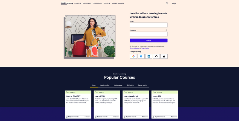
Codeacademy’s home page is the landing page for the majority of their display campaign, and it’s simple in both copy and design. The form on the page is straightforward and only requires the essential information, and it even allows users to sign up using an existing user account across a variety of other platforms such as Google or LinkedIn.
As you scroll down the page, it presents clear information about available courses including free ones, and provides genuine accounts of success, testimonials, and additional social proof to assist visitors who require more details before signing up. This approach aims to make the world of coding more accessible and less daunting, particularly for beginners.
Homepage: https://www.codecademy.com/

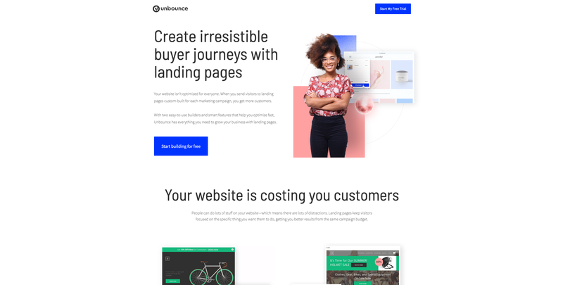
The Unbounce landing page effectively communicates its value proposition through a benefit-focused headline, outlining how it can assist the user. The page emphasises the campaign using language that aligns with their advertisements. To minimise distractions and maintain focus, the top of the page outlines a clear call to action, removing navigation or irrelevant content.
As users scroll down the page, they are presented with compelling illustrations of how the software can effectively support their brand. This is followed by a simple pricing structure and repeated CTAs to focus on conversions.
Search ad landing page: https://unbounce.com/landing-pages-overlays/


"Long forms that ask for too much information are off-putting - you can only expect users to part with their data if you’re giving something high-value in return."
- Katie Smith, Social Media and Content Manager

"Not thinking about the landing page early enough in the process and then having to rush something together in time for the launch of the campaign."
- Neil Hannam, Search Marketing Manager

"Slow page loading times are a no-no, you need to optimise your landing page to ensure a fast and smooth user experince."
- Jake Dickinson, Front-end Developer

"Designers not thinking about the context of where I might use the form that is linked on the landing page. Using small fields and radio buttons that are fiddly and not made for touchscreens!"
- Harshul Modha, Associate Director

"Jargon or 'in the know' language. Avoid using technical or industry-specific terms that may alienate users."
- James Morgan, Senior Account Manager

"Cluttered design and navigation. Avoid overwhelming visitors with excessive elements, make sure to maintain a clean, user-friendly layout."
- Jamie Mollart, Director

"You need to make sure your landing page ties into the ad creative in any way so the user journey doesn’t feel disconnected."
- Chelsie Byrne, Senior Account Director