Can AI create an advertising campaign?

Can AI create an advertising campaign?
Our Lead Creative, Dom, tasked two AI image generators to develop an advertising campaign for his f…
Read article

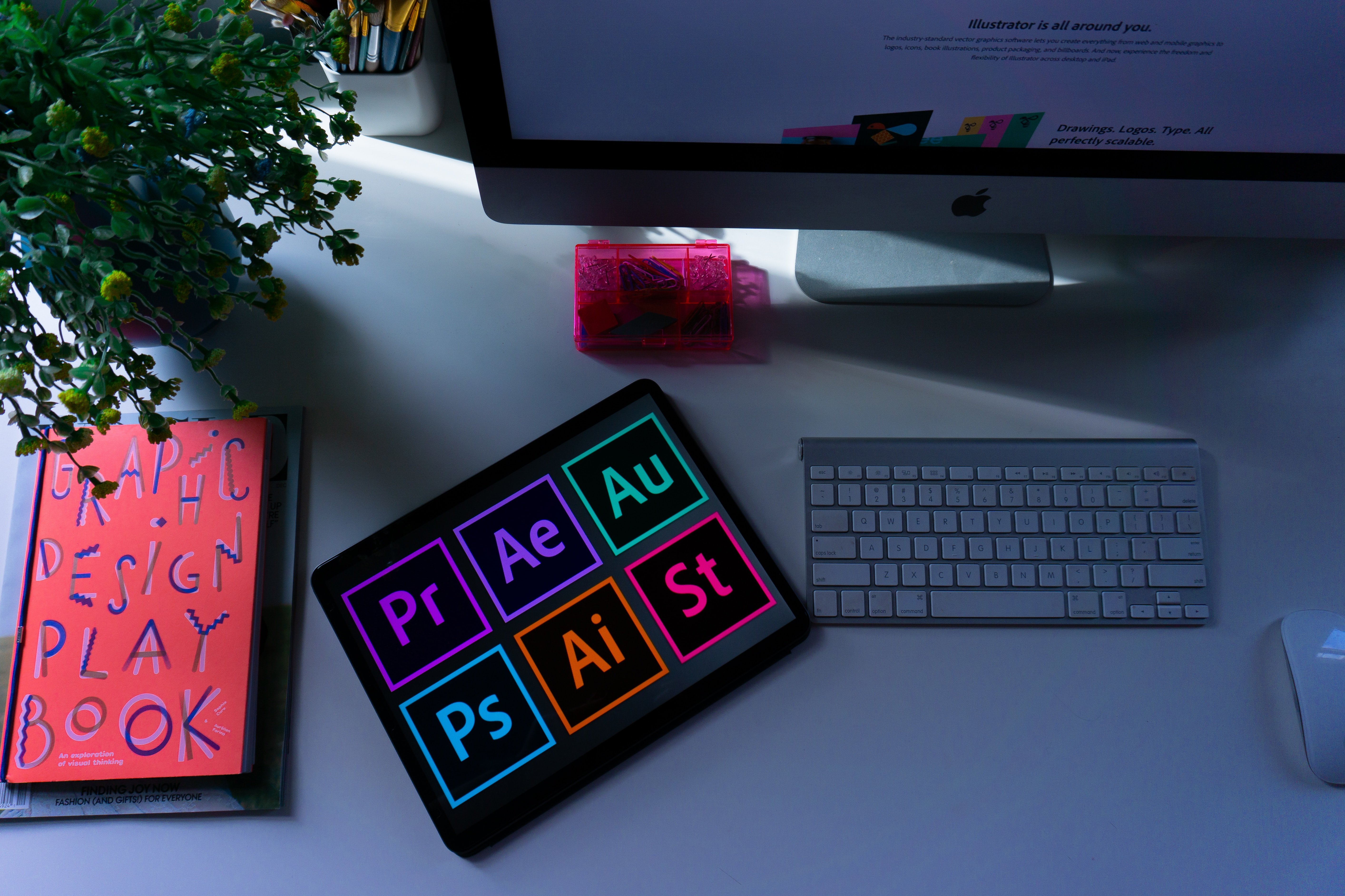
Inspired by a type designer's work, our Creative Director, Dom, reached out to ask for permission to use it. Years later, that font remains one of his favourites, and here he tells us why he loves it so much, and the importance of font choice in creative work.
As a graphic design student back in the late 2000s, low on cash but high on love for the finer fonts in life, I contacted a type designer named Alejandro Paul with a cheeky request. I loved his typographic style, and still do, particularly his script fonts which have such an eloquent rhythm to them.
The student project I was working on was a rebrand of the retro kitchen cupboard staple: Angel Delight. His font ‘Amorinda’ was the perfect fit, owing to the smooth blend of letters which melted together so tastefully to convey the modern confectionery feel I was after.
The only problem I had was the aforementioned lack of cash, so with my ‘don’t ask, don’t get’ mindset I emailed him and asked if he’d send me the font for a discounted student price. A request he was kind enough to indulge, with the stipulation that the license was for student work only - I’d need to pay the extra to use it commercially.
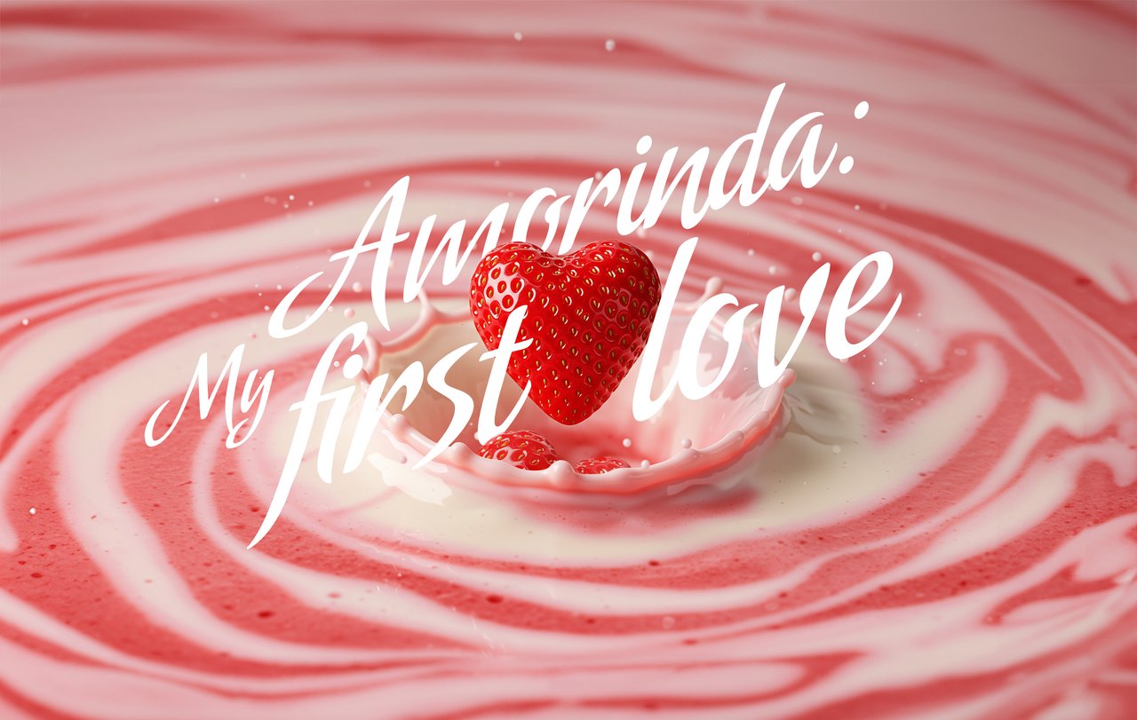
Skip forward a year or two later, with my student days behind me, I was working as a freelance designer and was commissioned to create a logo for a cupcake startup. Guess which font I thought of using? Yep, I lusted after ‘Amorinda’ again. Like with all design decisions, context is king so if the situation is right, return to your trusty favourite.
I wrote back to Alejandro Paul, explaining that I now needed a commercial license and, I think impressed that I was honest enough to contact him again, granted me permission without paying the extra. What a gent.
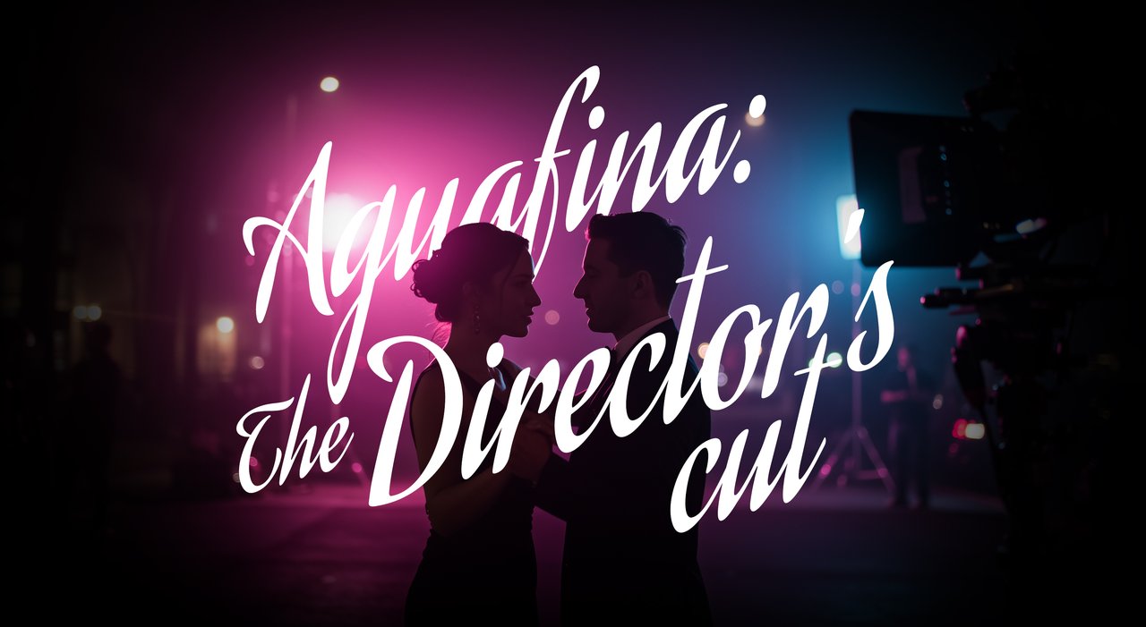
I thought of this story again recently when the movie Anora won best picture at the Oscars. The typeface used for the movie’s title was one of Alejandro Paul’s - I could spot his signature style a mile off, such playful elegance in the letterforms. In this instance it was the font ‘Aguafina’ and, as I discovered afterwards, the film’s director Sean Baker had used this same font for the title of all his films.
This is certainly unusual. Having a preference is one thing - John carpenter has a penchant for using Albertus in his end credits. Using the same one for the main title of all of your films is serious devotion, given that there’s a world of excellent type libraries out there, but it resonates with me.
As a creative your type choice is an extension of your vision for the project. It must tell the viewer something, must make them feel something. It’s inevitable that we find favourites and look for opportunities to use them again.
When it’s the first font you fell in love with too, as they say, the first time is the deepest.
From new logos to complete rebrands, our creatives can help your brand look its best. Get in touch with us today to find out more.
Let's talk
Our Lead Creative, Dom, tasked two AI image generators to develop an advertising campaign for his f…

Connecting with customers is crucial to a brand’s success. Investing in meaningful relationships wi…

Millions of people listen to podcasts every day, so why isn't it one of the most prominent cha…